BELA Brand Seafood | Rebrand

FROM HERITAGE TO LIFESTYLE
Leading the Tinned Fish Revolution
For over 30 years, BELA built a legacy as a trusted tinned fish brand. But with the tinned fish boom reshaping the market, BELA needed to evolve. Tinned fish had always been their way of life—now the world was catching up. To stay at the forefront, BELA needed a bold rebrand that honored its heritage while positioning it as the leader in the tinned fish lifestyle movement. The goal: own the shelf with stand out packaging, dominate social media, and launch their first-ever D2C website.


GRIT MEETS BOLD DESIGN AND STORYTELLING
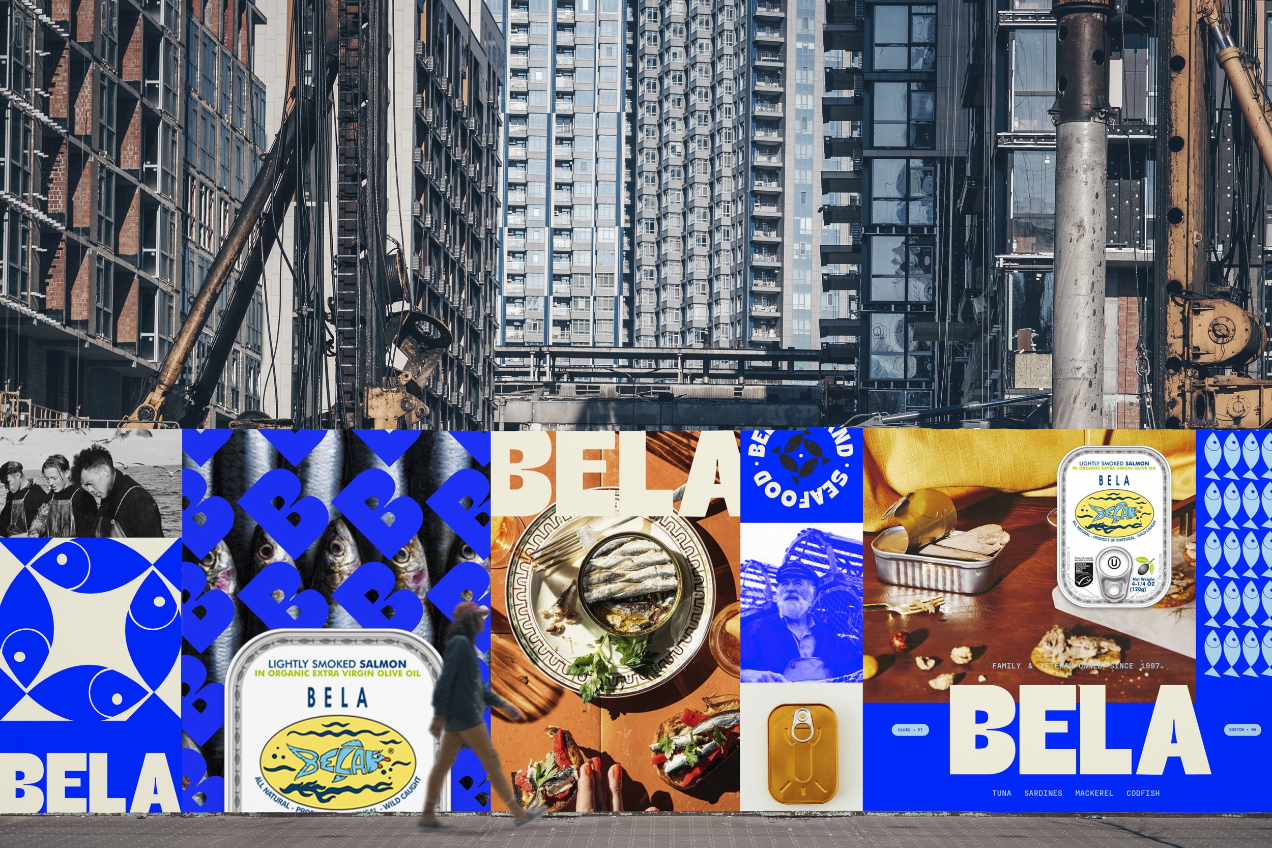
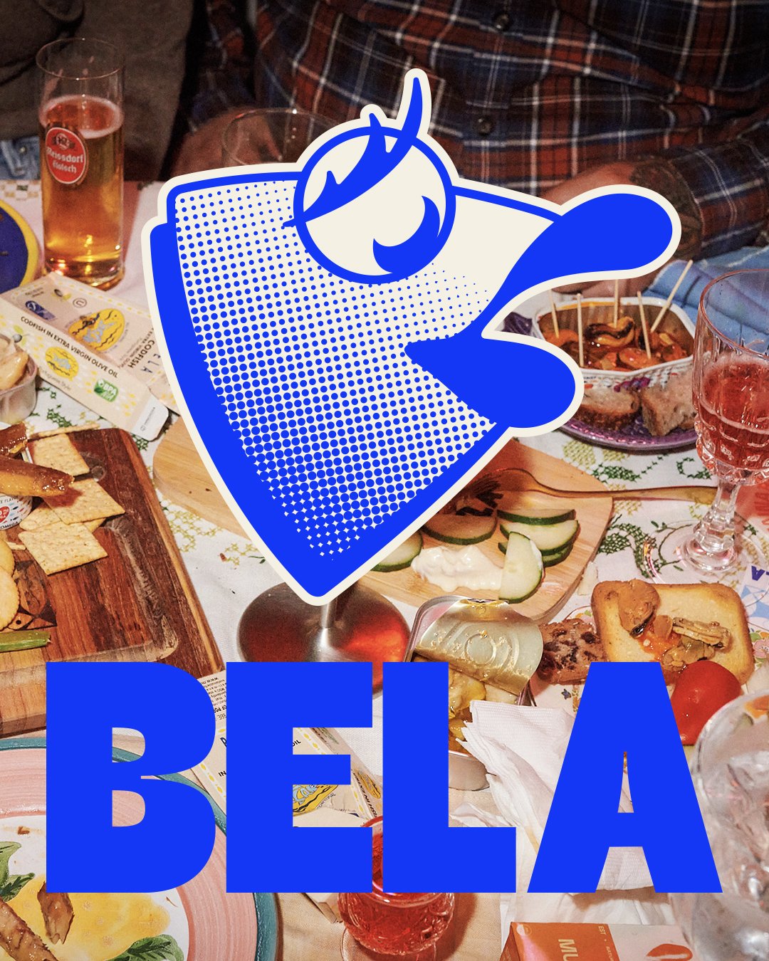
BELA’s rebrand went far beyond visuals—it was about capturing authenticity, heritage, and the beautiful chaos of real life. Inspired by BELA’s Portuguese roots and New England grit, we crafted a bold visual identity with ink-trapped typography, layered textures, and dynamic patterns. The logo—a clean, balanced wordmark—is instantly memorable, while supporting marks add history and context, layered to reflect the joyful messiness BELA stands for.
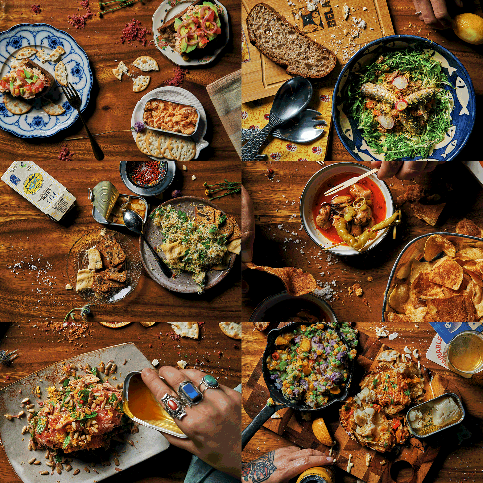
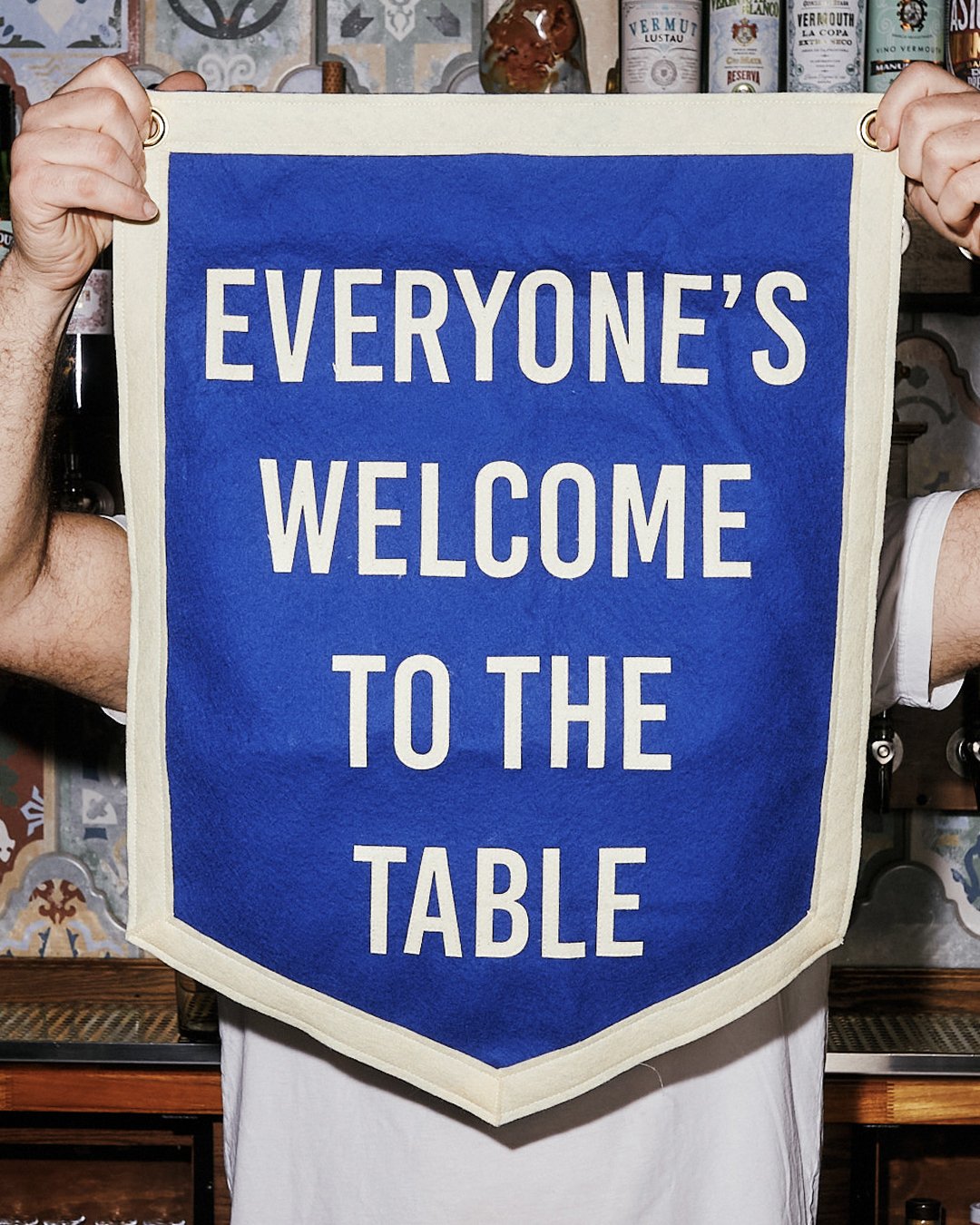
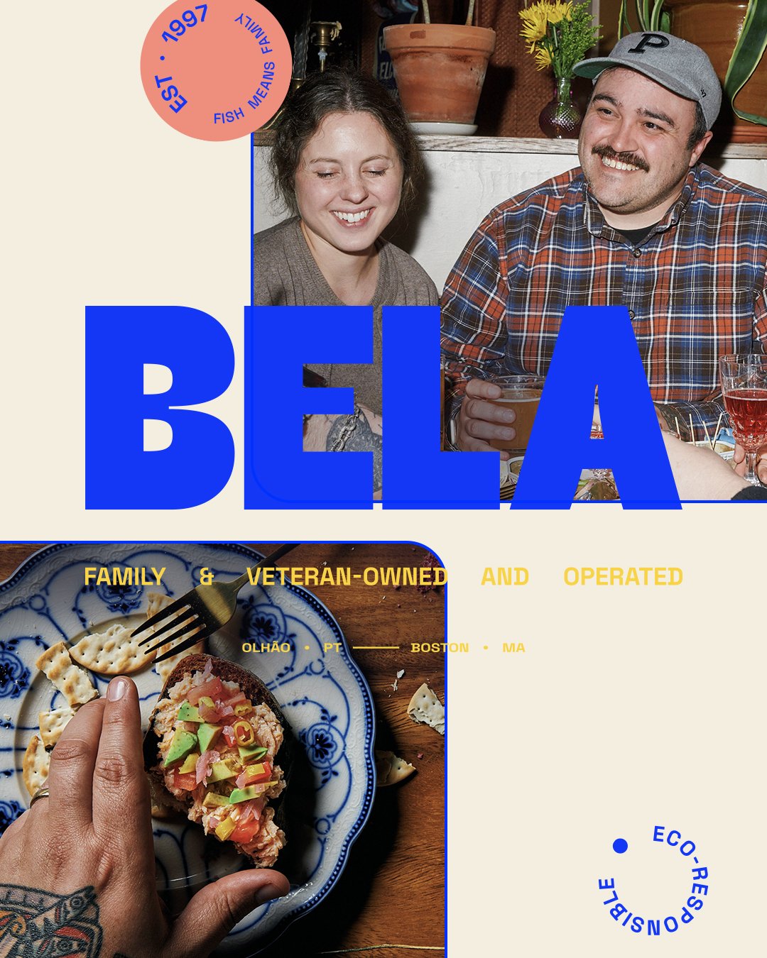
We introduced two taglines—“Everyone’s Welcome to the Table” and “Fish Means Family”—to highlight BELA’s founder-led, family-owned ethos. Real people and moments take center stage, from families around messy tables to workers on the cannery floor. Authenticity shines through gritty, hard-flash photography, capturing the joyful, imperfect chaos of shared meals, chefs in action, and the canning process.
This rebrand transformed BELA into more than a seafood company—it’s now a lifestyle brand rooted in real stories and real moments.
Unapologetically Authentic
We developed a bold visual identity inspired by BELA’s Portuguese heritage and New England grit. Bold ink-trapped typography, layered textures, and dynamic patterns come together to create a design system that is unapologetically authentic, modern, and unmistakably BELA.
A Word Mark Like No Other
The logo—a clean, bold wordmark—is so perfectly balanced that it’s instantly memorable, embedding itself into the mind. Supporting brand marks add depth, nodding to the brand’s history, roots, and regional pride.
Layers, Layers, Layers
To amplify this, we layered and stacked these elements to create a feeling of visual chaos, echoing the messy, joyful moments that the brand stands for.

Everyone’s Welcome to the Table
←
Everyone’s Welcome to the Table
←
Everyone’s Welcome to the Table ← Everyone’s Welcome to the Table ←
Fish Means Family
→
Fish Means Family
→
Fish Means Family → Fish Means Family →

Fish Means Family
BELA’s rebrand was also driven by storytelling. We created two taglines—“Everyone’s Welcome to the Table” used for lifestyle and “Fish Means Family” used with product. Each encapsulate the brand’s ethos. This is a founder-led, family-owned business, and their values shine through in every detail. The brand celebrates real people, from the families sharing meals to the workers packing cans. The grit, the mess, and the joy—it's all part of the story.

Authentic Photography
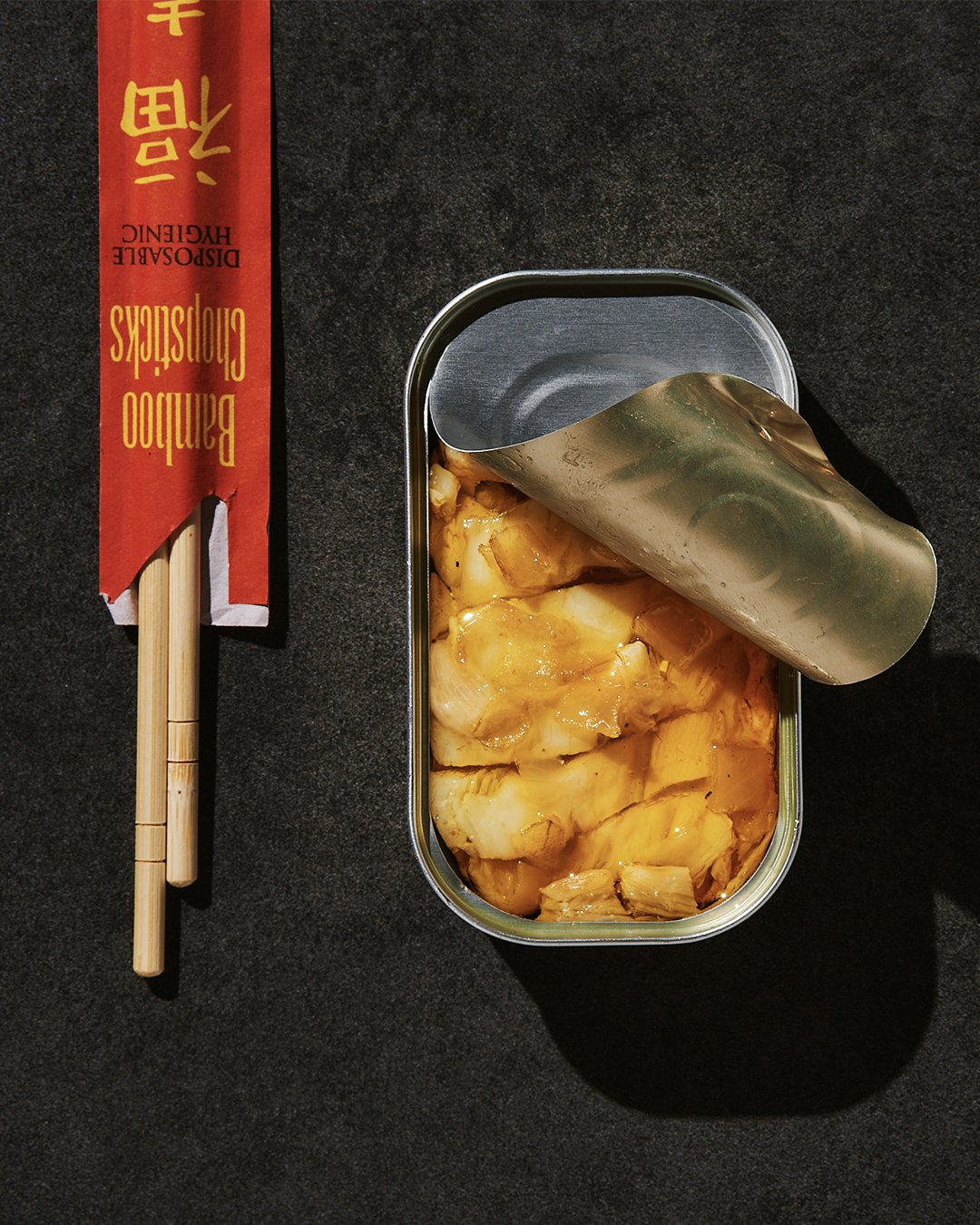
The photo style brought this authenticity to life. We captured raw, candid moments with a hard-flash aesthetic: families laughing around a messy table, chefs prepping in chaotic kitchens, and the hands-on process of canning fish. Every photo feels like a snapshot of real life—joyful, imperfect, and undeniably human.
This Wasn’t Just a Rebrand.
It made BELA as real as the moments She represents.

A Digital Home for the BELA Lifestyle
We built BELA’s first-ever direct-to-consumer website, making sardines cool again. The site doesn’t just sell cans; it sells a lifestyle. From messy, joyful tabletop scenes to family-filled kitchen chaos, the website brings BELA’s brand pillars to life.
We make finding the perfect can of fish effortless—shop by fish type or flavor & oil. Whether you’re loyal to one fish or chasing a specific flavor, we let you explore, mix, and match like a pro.
Easy navigation, compelling copy, and gritty, candid photography create an experience that’s raw and approachable, yet polished enough to compete with the biggest players. And yes, it converts.

SOCIAL
Lifestyle, Not Just Seafood
We turned BELA into a social-first brand, creating content that’s raw, real, and led by founder Josh Scherz. From recipe drops to factory tours, BELA’s voice now lives across every channel, connecting with audiences authentically.




Shelf
Domination
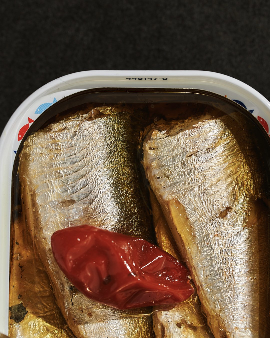
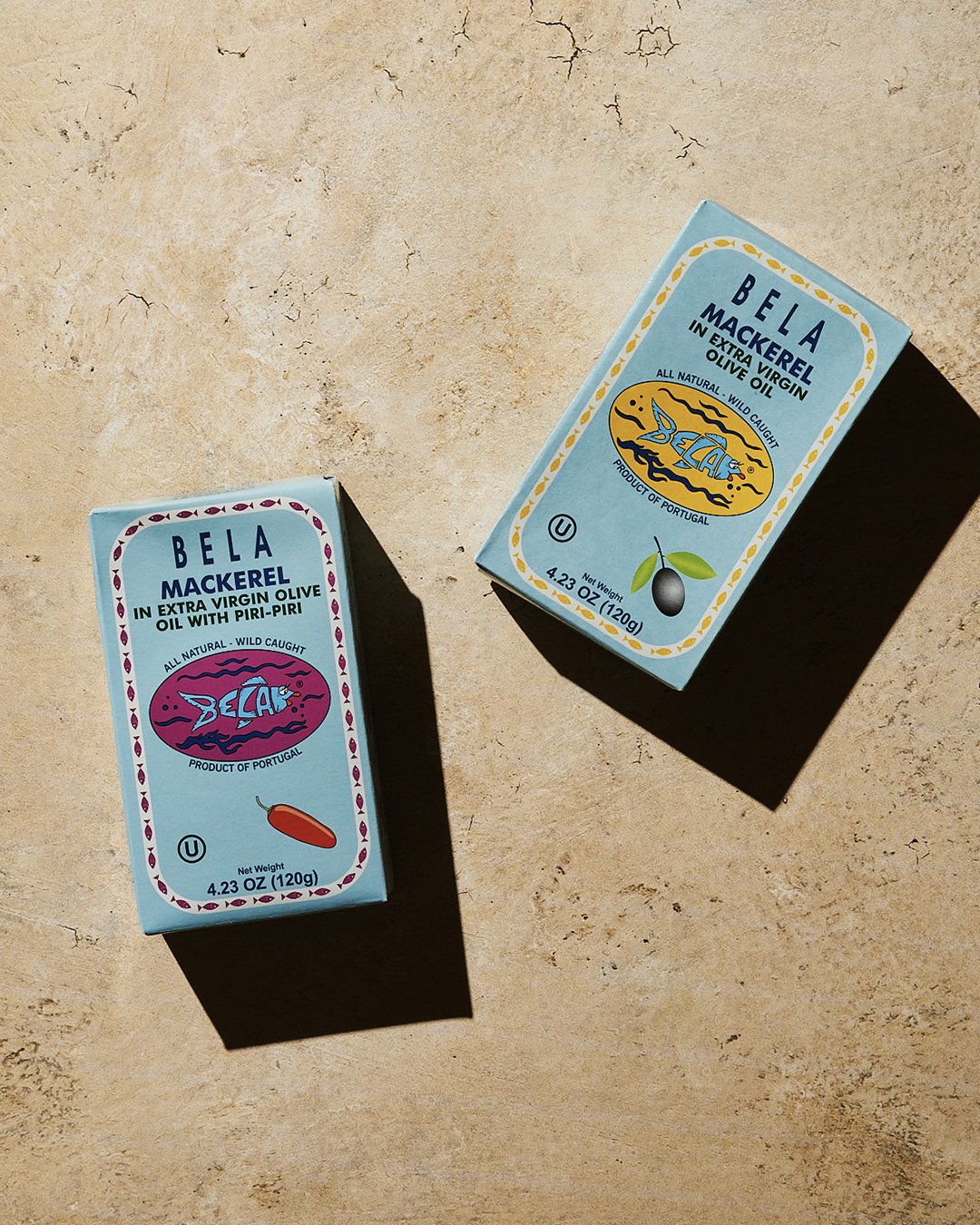
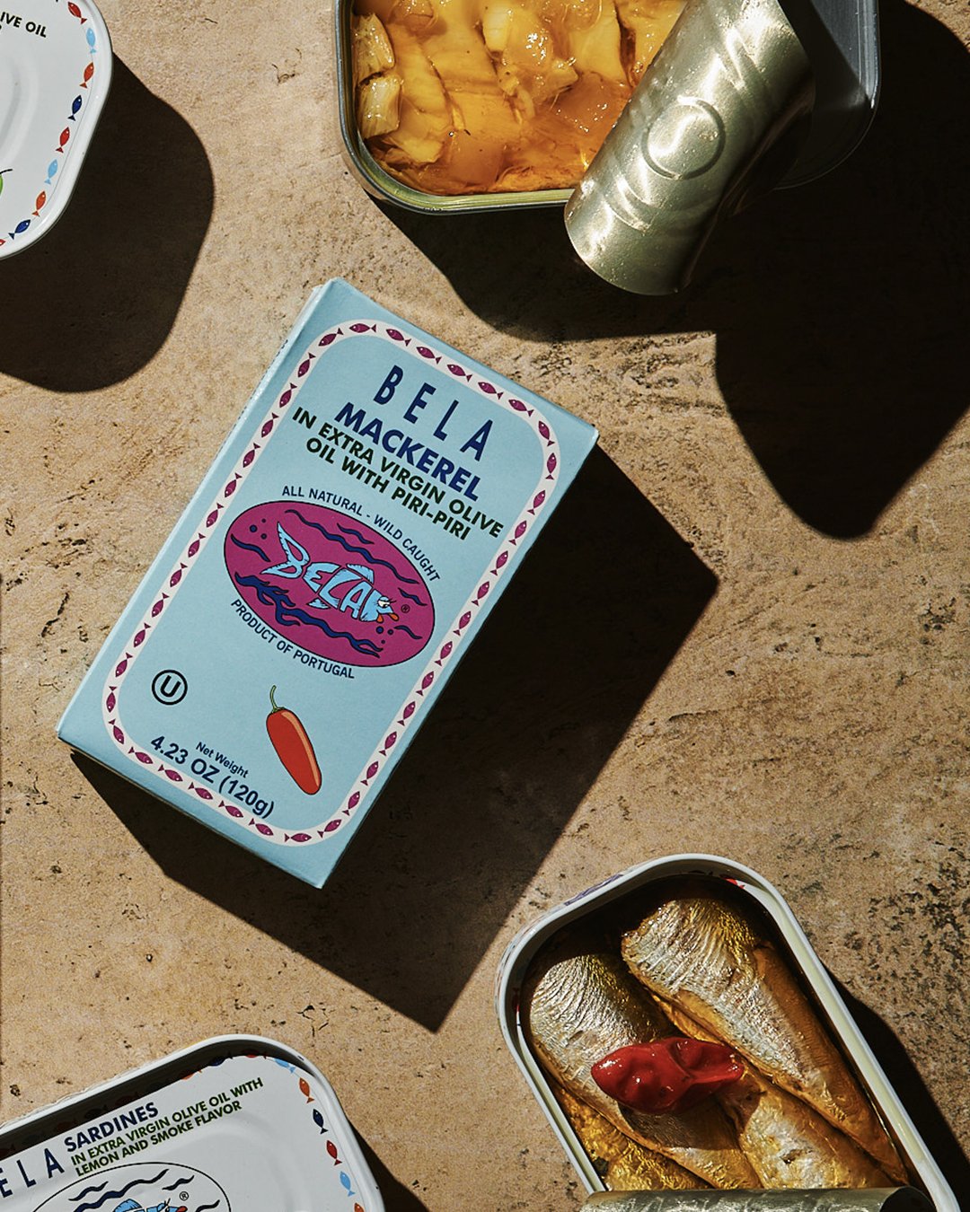
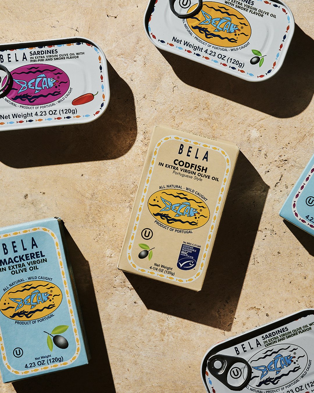
BELA isn’t just another can on the shelf—it’s the one you can’t ignore. Electric colors, nostalgic halftone patterns, and modern, clean typography give BELA an unmistakable presence in an often-overlooked category.
We built a full design system that extends across every SKU—each protein gets its own bold colorway, flavors are coded into a structured palette, and halftone fish illustrations make every can feel both historic and fresh. This system carries through wholesale shipping, ensuring that even the bulk supply chain reflects the brand’s sharp, cohesive identity.


